Tutorial
Installing InsarViz
To install the InsarViz tool, please follow the install instructions.
Launching InsarViz
Simple launch
Once InsarViz is correctly installed, you can simply launch it with the command:
ts_viz
Launch with input file
If you want to launch the tool directly with a data file open, then use the -i input handle:
ts_viz -i /path/to/my/data/file
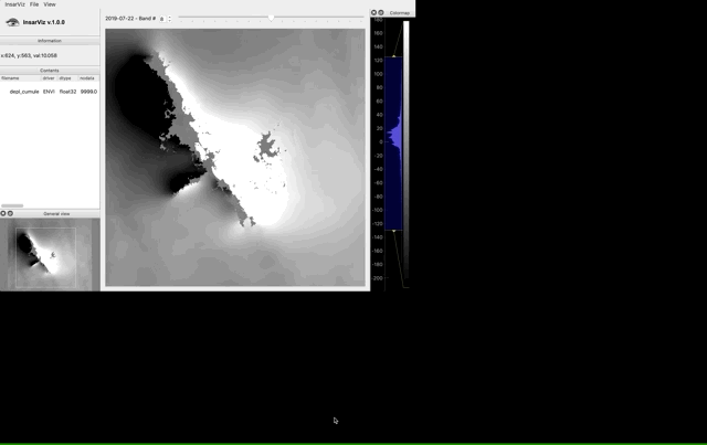
Main window
The main window that opens up when you launch the tool is divided into three vertical panels:
on the left, from top to bottom, you will find the InsarViz logo and version, the Information box, the Contents and General View sub-windows.
in the center, the Band/date setter slider and the main Map
on the right, the Colormap panel.
the Information box displays the values (x, y, and the value from the dataset) of the point under the mouse cursor when you hover over the Map
the Contents shows the loaded dataset name and info from its metadata file
the General View is a full-extent view of the map with a black rectangle marking the area currently displayed in the Map
the Band/date setter and slider allows you to navigate in the temporal dimension of the dataset; either by setting a band number in the numerical input box, or using the arrays or slider to switch between bands/dates. When available (in metadata), the date corresponding to the displayed band is shown on the left of the band setter.
the Map is where the data is displayed
the Colormap panel is where you control the color palette and parameters to display on the Map and General View. See [here](#tasks) for more details.
The General View and Colormap sub-windows can be detached from the main window or closed. Use the View menu to show them again after you have closed them.
Loading data
If you have not used the Launch with input file method when starting the app, you can load data using File > Open. This launches a dialog window to retrieve your dataset (see Supported formats).
When a dataset is selected, an image from the middle of the time series is displayed in the Map. Loading time is shown in the Terminal.
Performance
The dataset is loaded dynamically: as you navigate through the time series, new bands are loaded and rendered. Only the rendering image is stored for later display, the data is not stored as this would dramatically reduce performances.
Color rendering
The Colormap panel is used to control the rendering in the Map and General View windows.
On the left, the histogram shows the distribution of the values from the data of the band currently displayed. You can scroll or right-click +drag to zoom in/out on the histogram.
The colorbar on the right shows the current color palette, which can be changed through right-click.
The area in blue on the histogram shows the mapping of the color palette on the data distribution: you can move this area and change its boundaries using left-click+drag.
You can export this colormap through right-click > Export, to use as legend to the Map in a figure.

Exploring the data
The InsarViz tool is designed to efficiently explore large InSar time series.
Plotting tools
In the menu bar, select View > Plotting to access the plotting tools (or Ctrl+P).
This opens two new windows and adds a toolbar above the Map in the main window.
In the Temporal Profile window, plots are displacement versus time, one curve on this plot represents one pixel on the Map. The thick vertical line in the Temporal profile window marks the band/date currently displayed in the Map, and can be used to change the displayed band/date (left-click + drag).
In the Spatial Profile window, plots are displacement versus distance on the Map, one curve on this plot corresponds to the displacement of the pixels selected on the Map at a given date.
The Plotting toolbar in the main window contains three mode buttons, Interactive, Points and Profile, a Reference button, and a Clear profiles button to reset the plots.
When launching the plotting toolbar, the default mode is Interactive. This means that as you hover the cursor over the Map, a temporal profile of the point under the cursor is interactively drawn in the Temporal Profile window (thick red line). This mode allows for rapid, dynamic exploration of the whole dataset. Nothing is drawn in the Spatial Profile window because no point has been selected yet.
When the Points tool is selected and used on the Map (left-click), individual points can be selected whose data will be drawn in the plots.
Selecting the Profile tool in the main window switches to Profile mode to draw a profile line on the Map: the first left-click select the starting point of the profile and subsequent left-clicks will extend the profile line. The profile line is shown in red on the Map, and a number of points are subsampled along this line (white dots) whose data is plotted in the plot windows.
The Reference tool is used after having plotted some data (using the Points or Profile tools) to select a point (one left-click) or area (left-click two points which will be used as opposing corners of a rectangular area of selection) whose data will be used as reference: previously plotted data will then be adjusted to the new reference point (mean of area’s data in the case of a the rectangular selection).
The thick curve in the Spatial plot corresponds to the currently displayed date/band.
In the plots, points (NOT CURVES) are clickable to access data values and (if click on temporal plot) the corresponding pixel on the Map is highlighted.
You can switch back to Interactive mode to display an interactive curve on top of the profiled curves, for comparison.
Use the Clear profiles button to reset the plots.
Plot options
The color theme of the plots can be changed (white or black background) using the light/dark switch button, to suit your screen display or printing preferences.
The plots are zoomable with scroll or right-click+drag. To go back to the full view, you can click the A button that appeared in the lower-left corner, or right-click > View all. You can also adjust the axes’ limits manually by left-click + dragging the plot or right-click to reveal the X-Axis /Y-Axis menus. Once you are satisfied with the axes settings, you can keep them using the Lock axes checkable box on the top left of the plot. You can also show/hide grids and access other axes options (log, invert…) through the right-click menu.
Clicking on the Zoom button at the top-left corner of the plot windows creates a sub-plot on the right side, showing only the blue area-of-interest now displayed in the main plot. This area is movable/customisable through left-click + drag.
To export the plot use the right-click menu > Export
Quit
You can exit the app: - using the menu InsarViz > Quit - using the shortcut Ctrl + Q.
Thank you for using InsarViz, see you soon!